
Your Custom Text Here


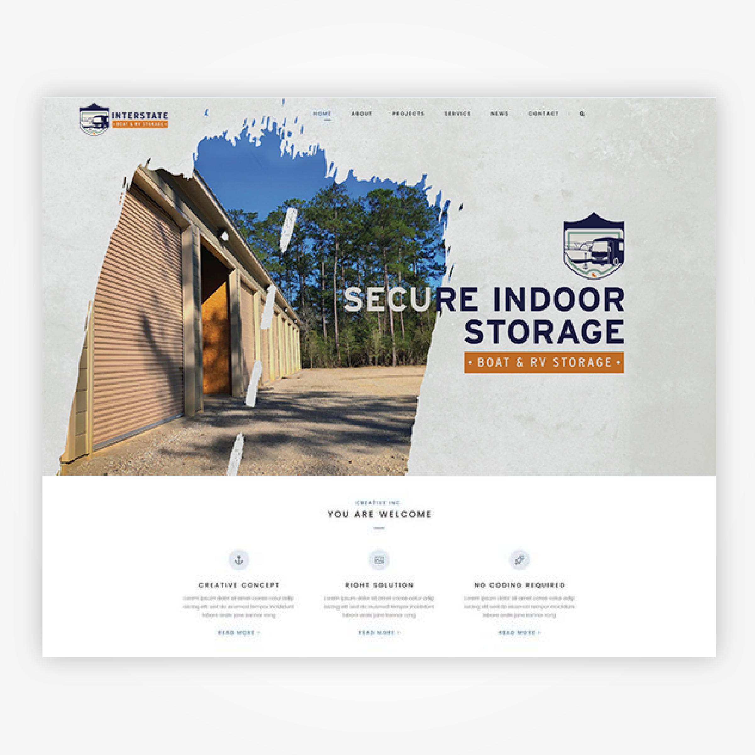
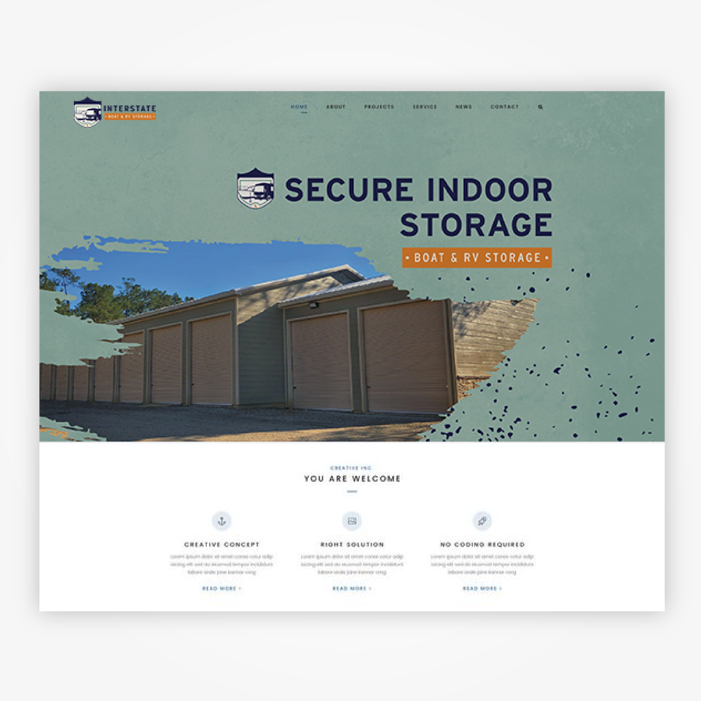
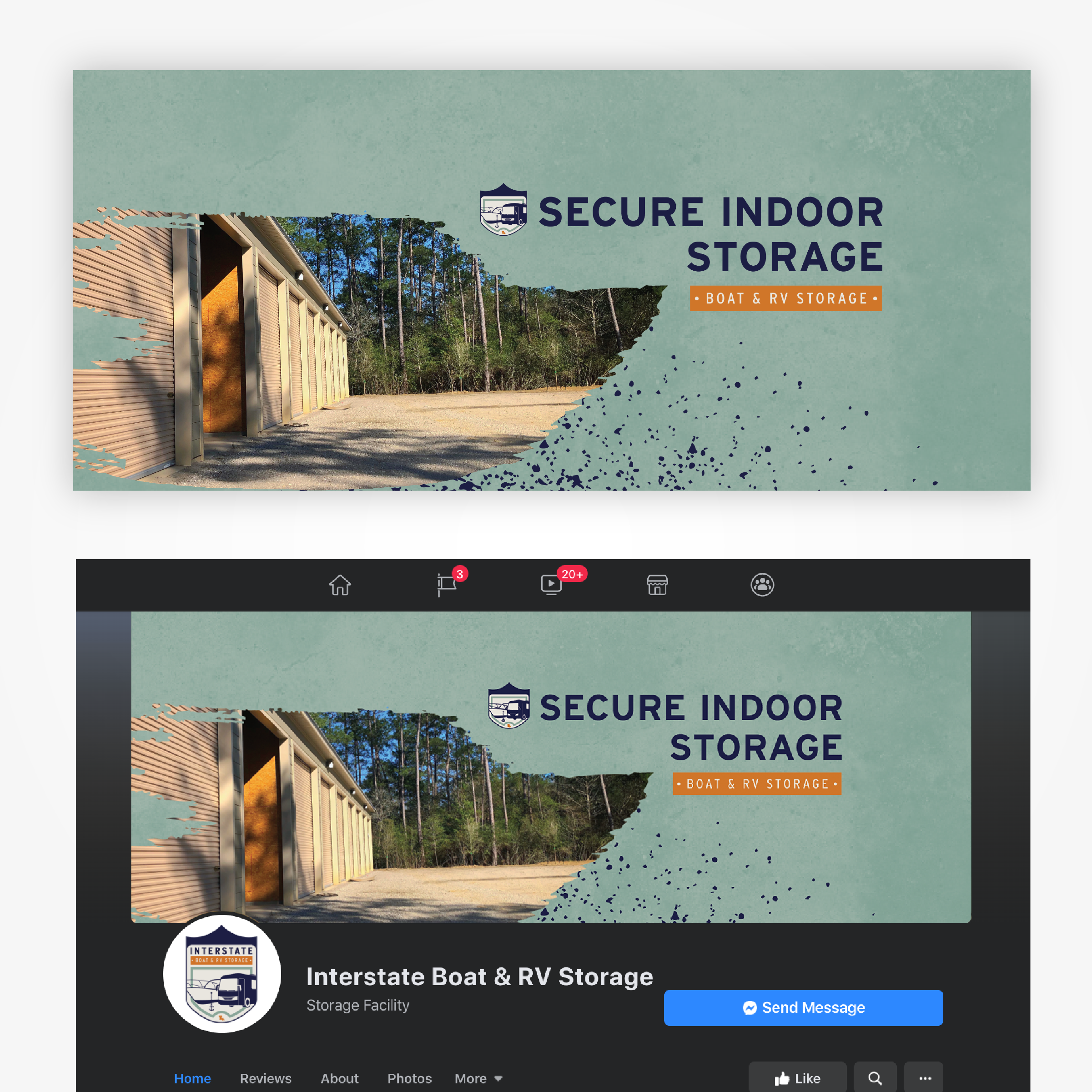
![Website Design [ bourbonwatchcompany.com ] (Coding outsourced)](https://images.squarespace-cdn.com/content/v1/5526d352e4b0a9b9c006314c/1662346741834-GNOWLNUSXWGJRTGFGJRK/BWC+Website-01.png)


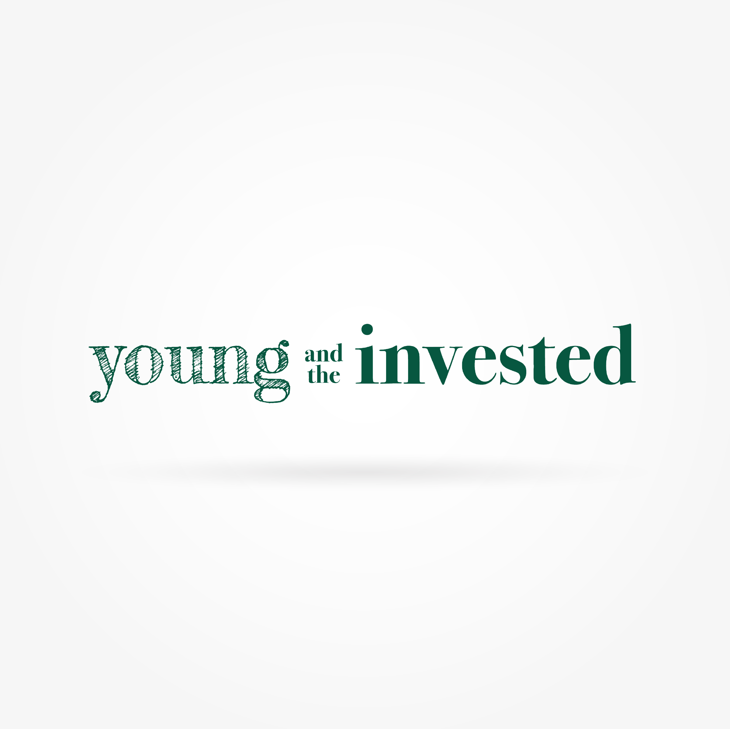

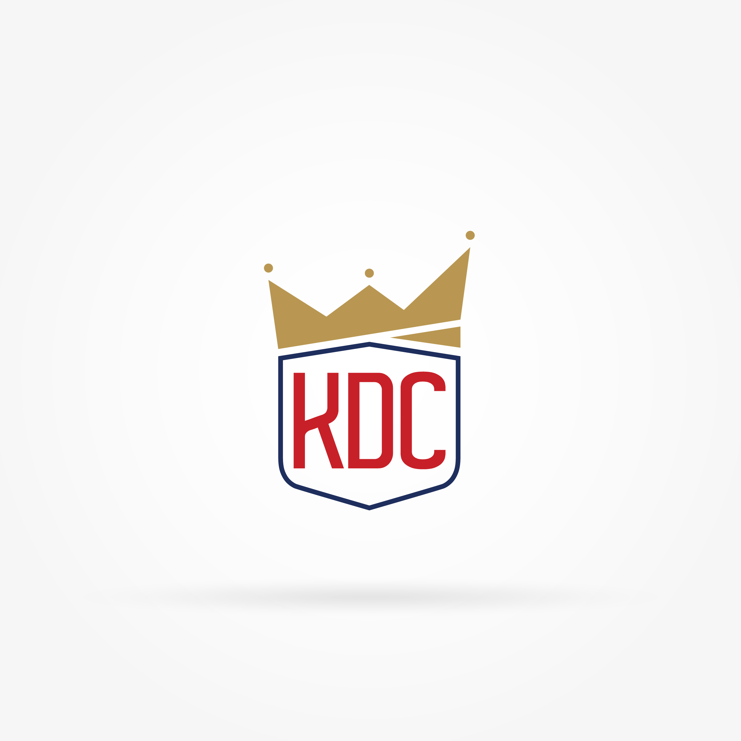


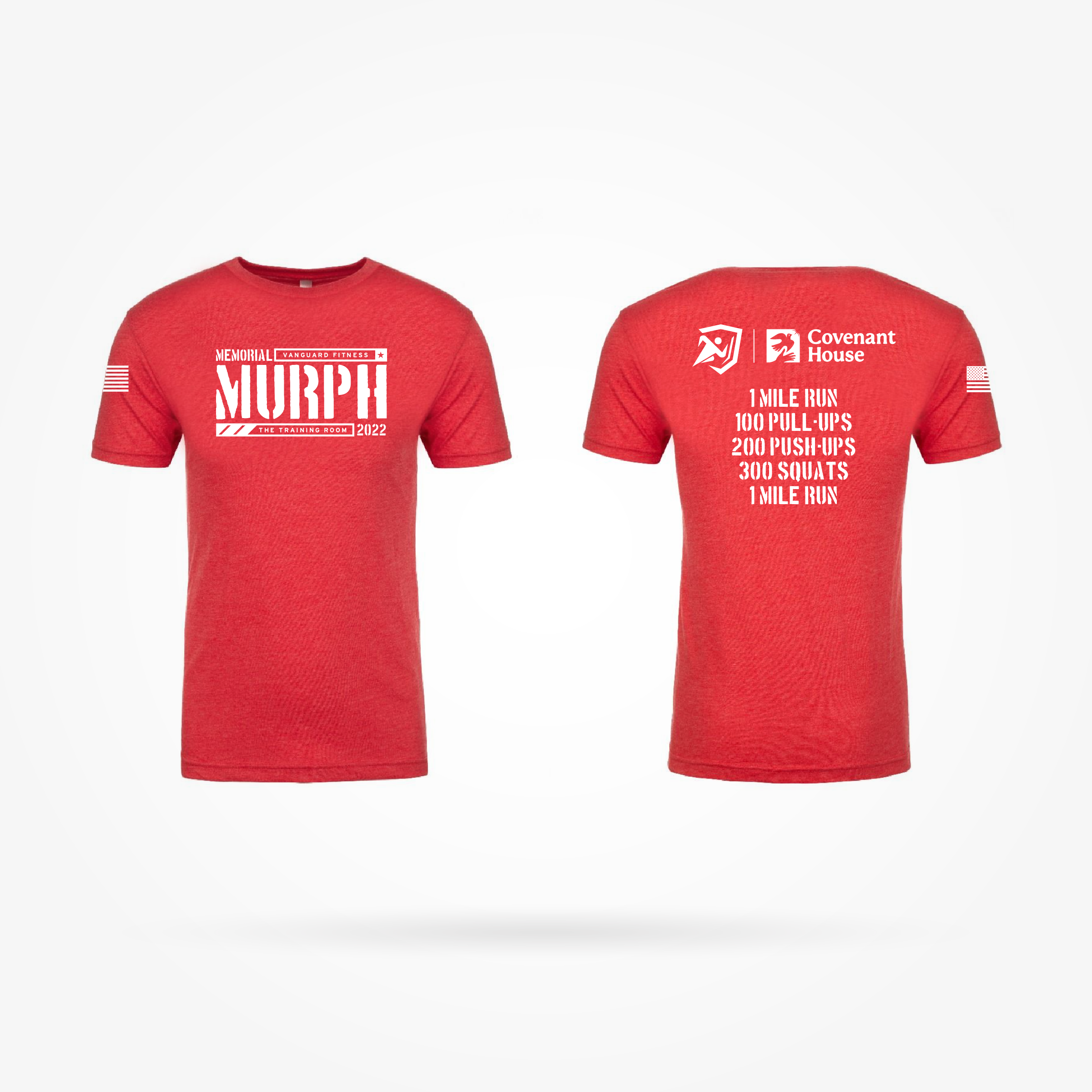


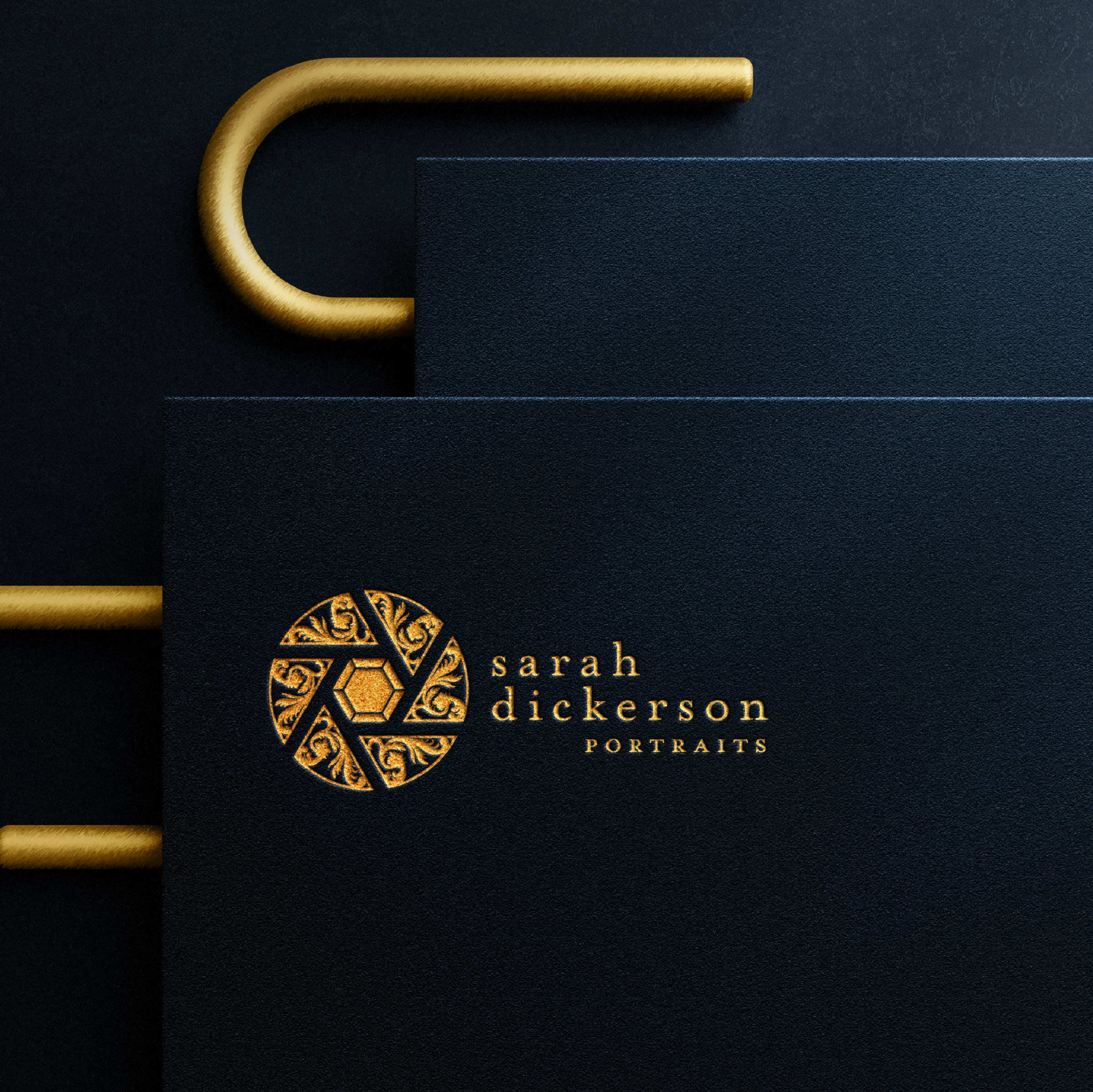
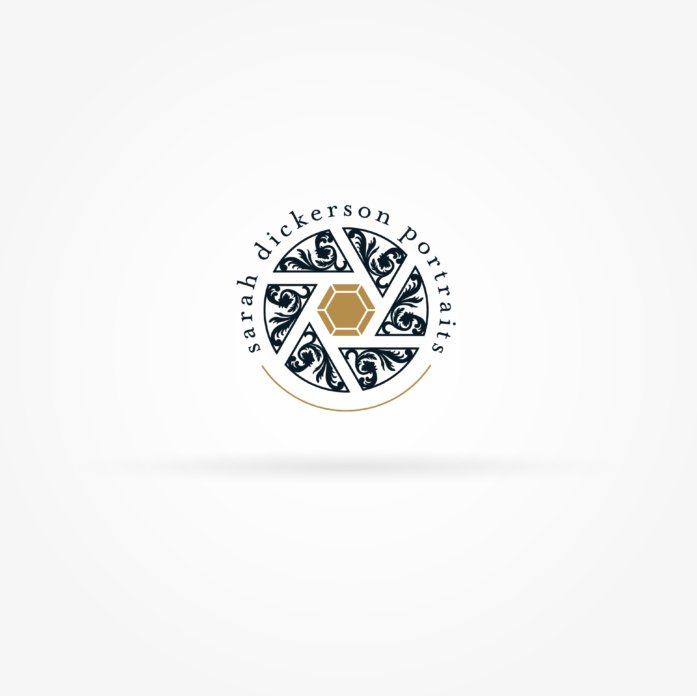
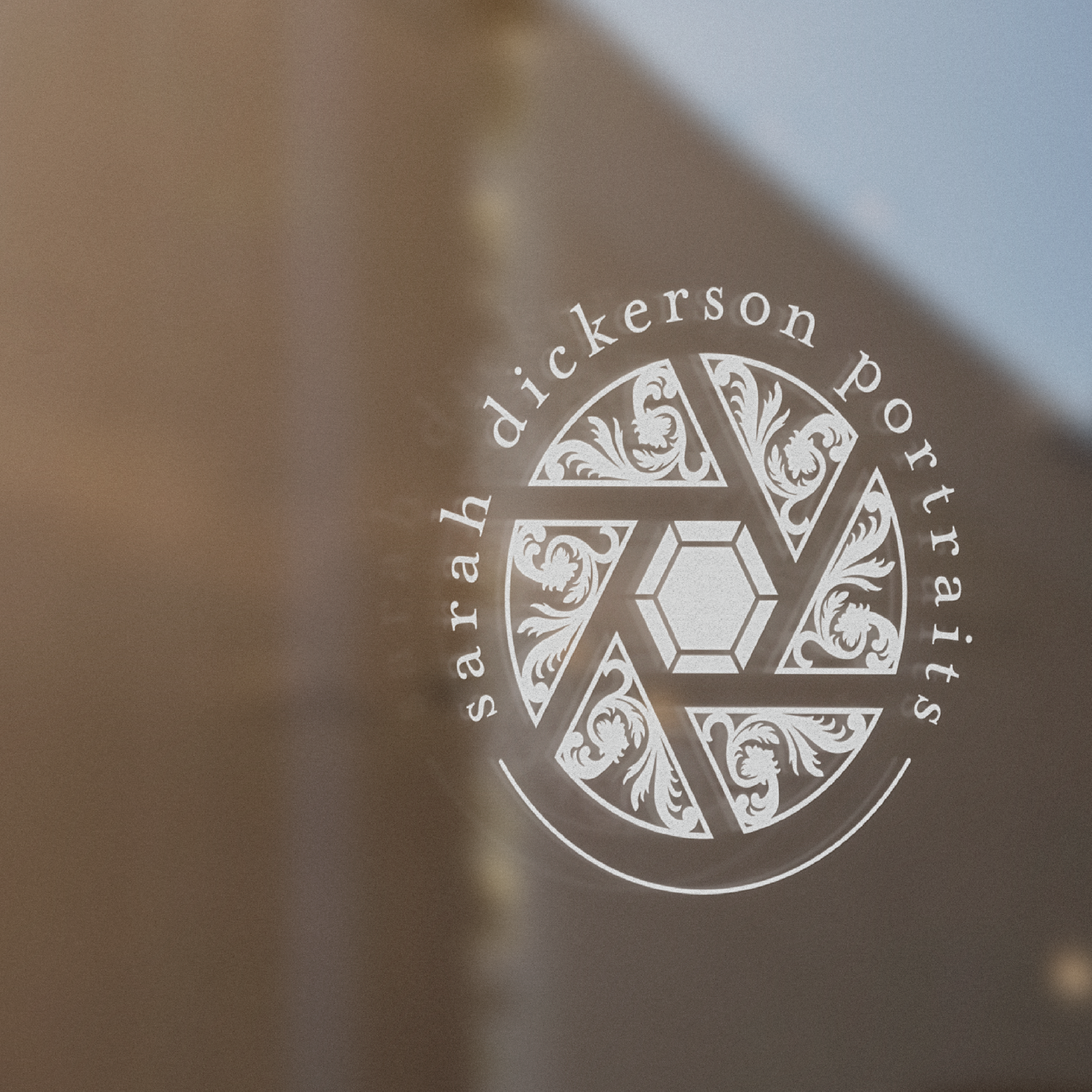

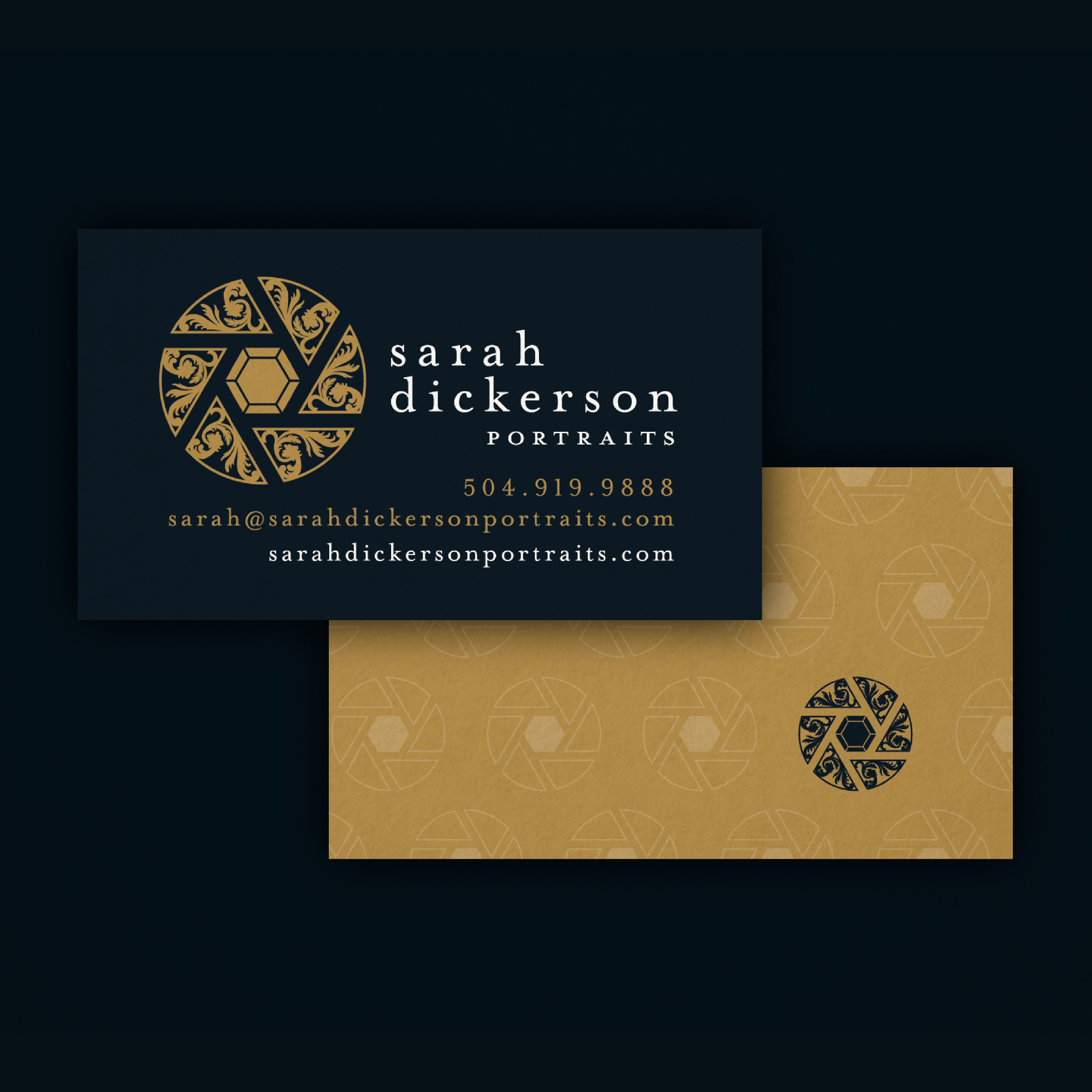


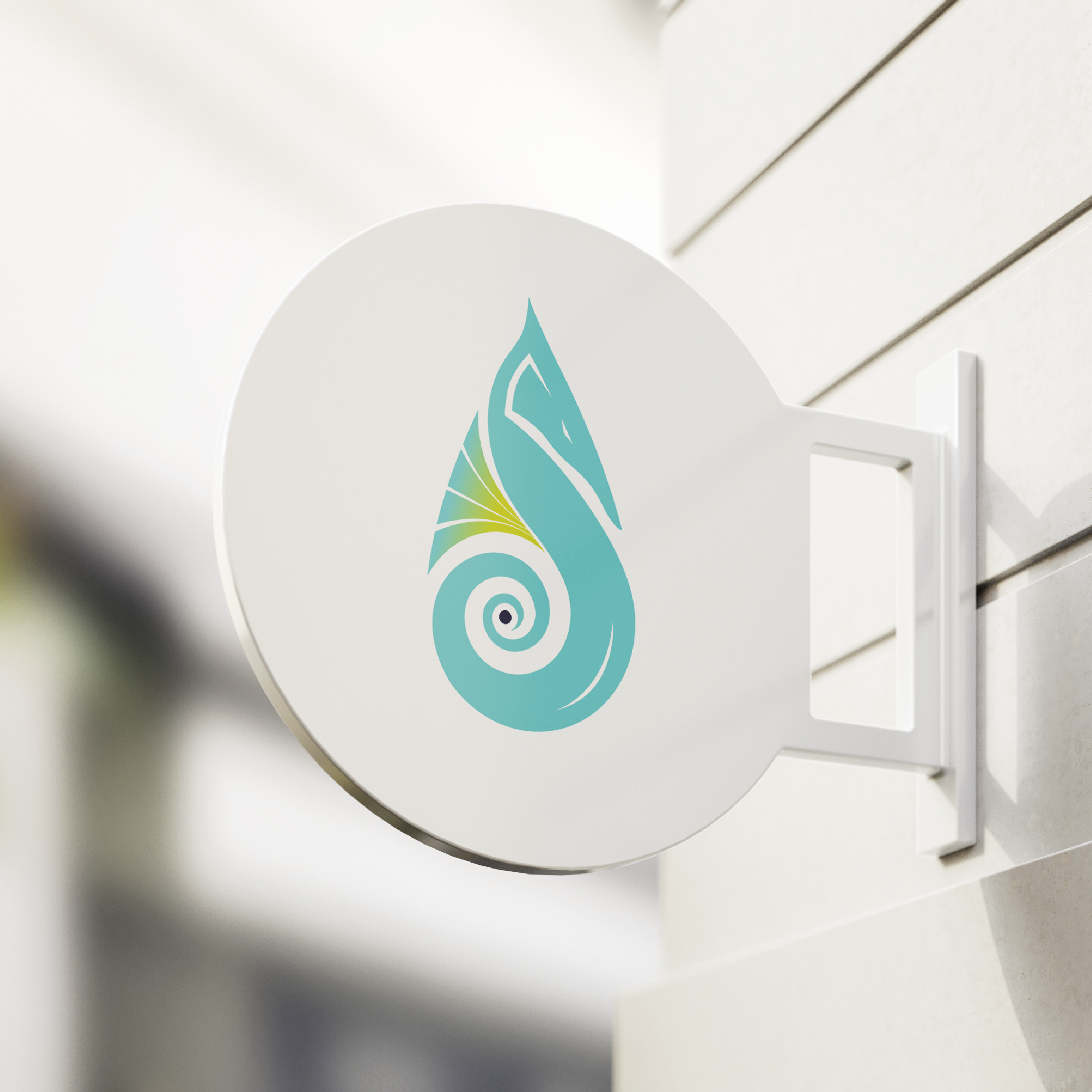
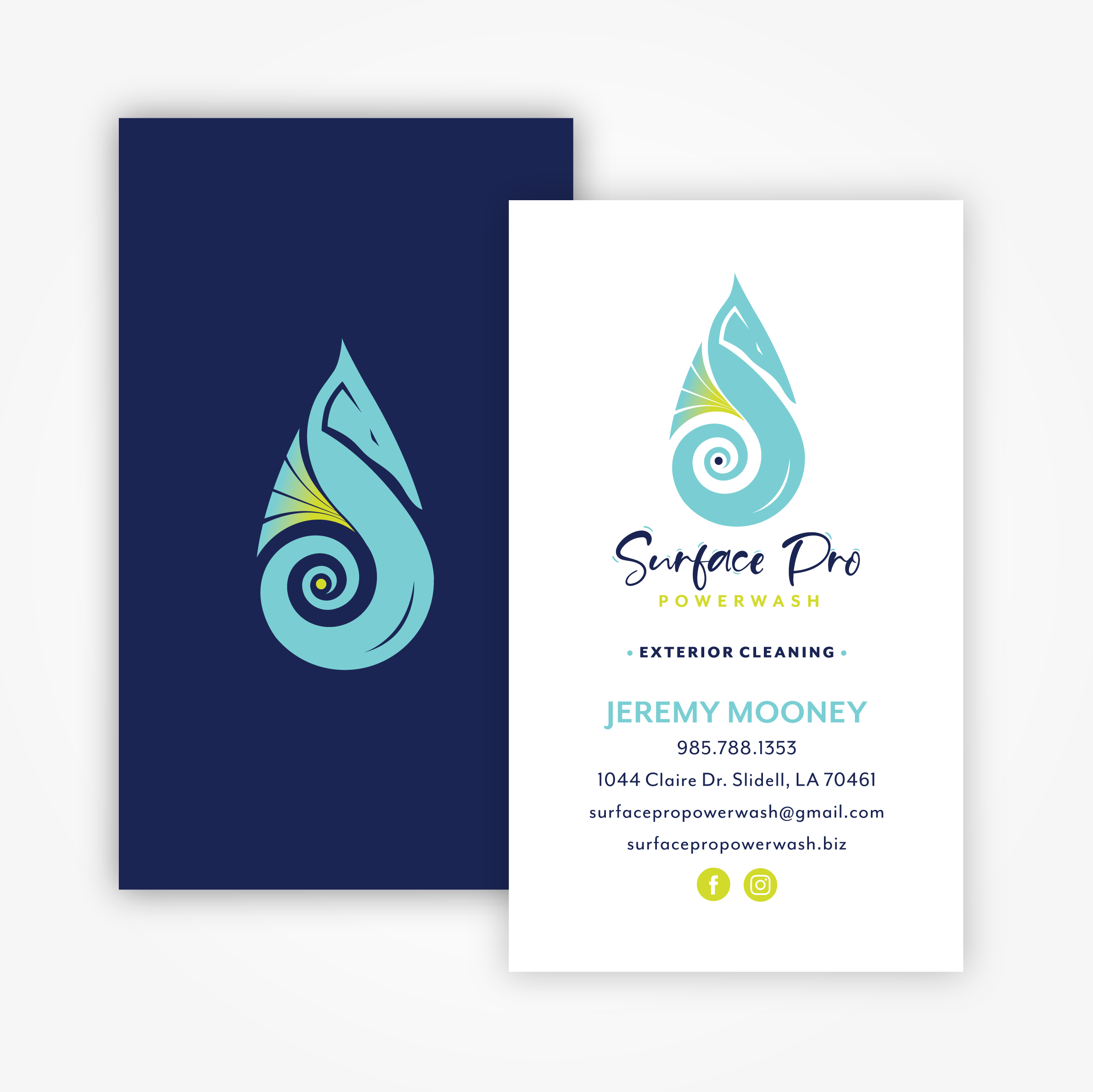


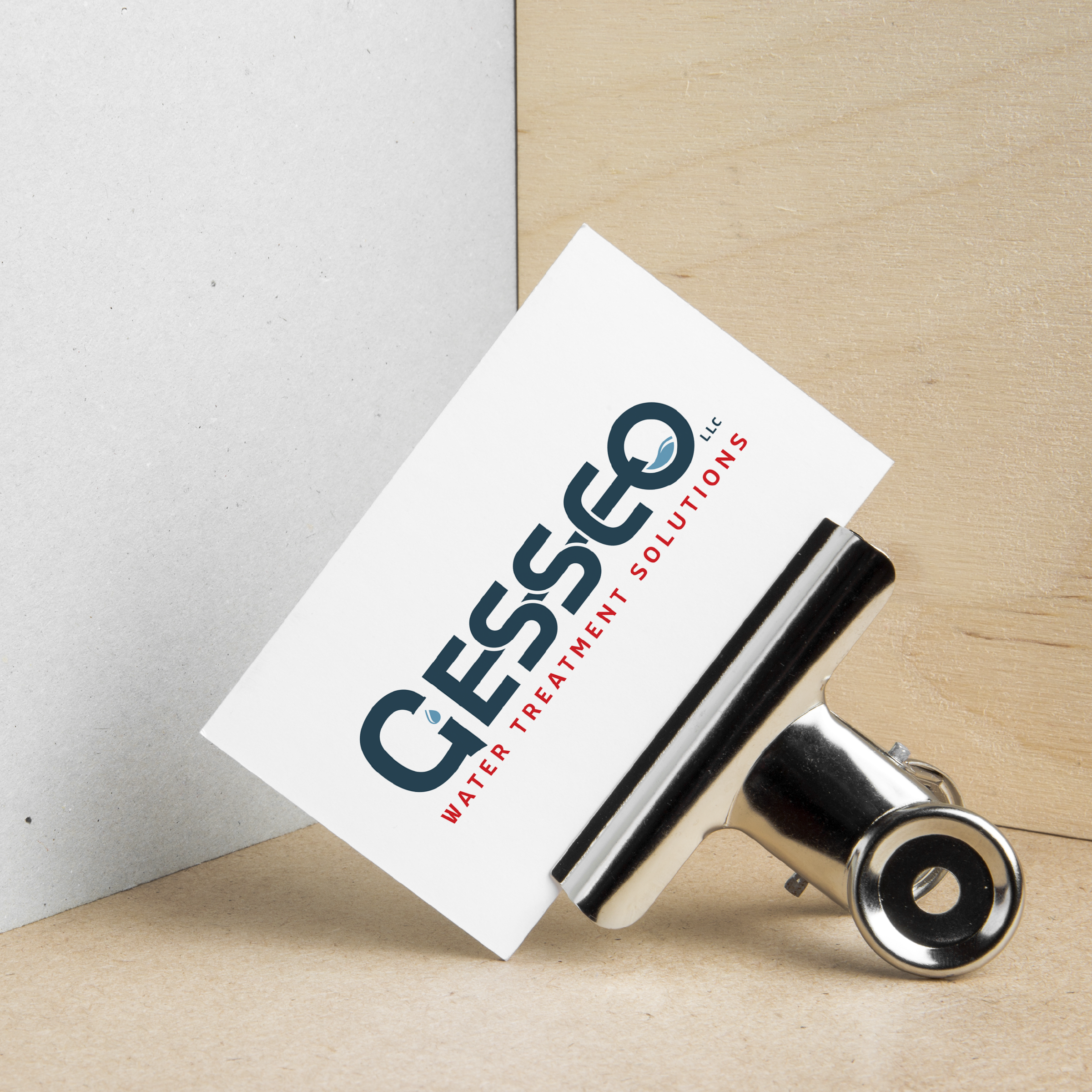


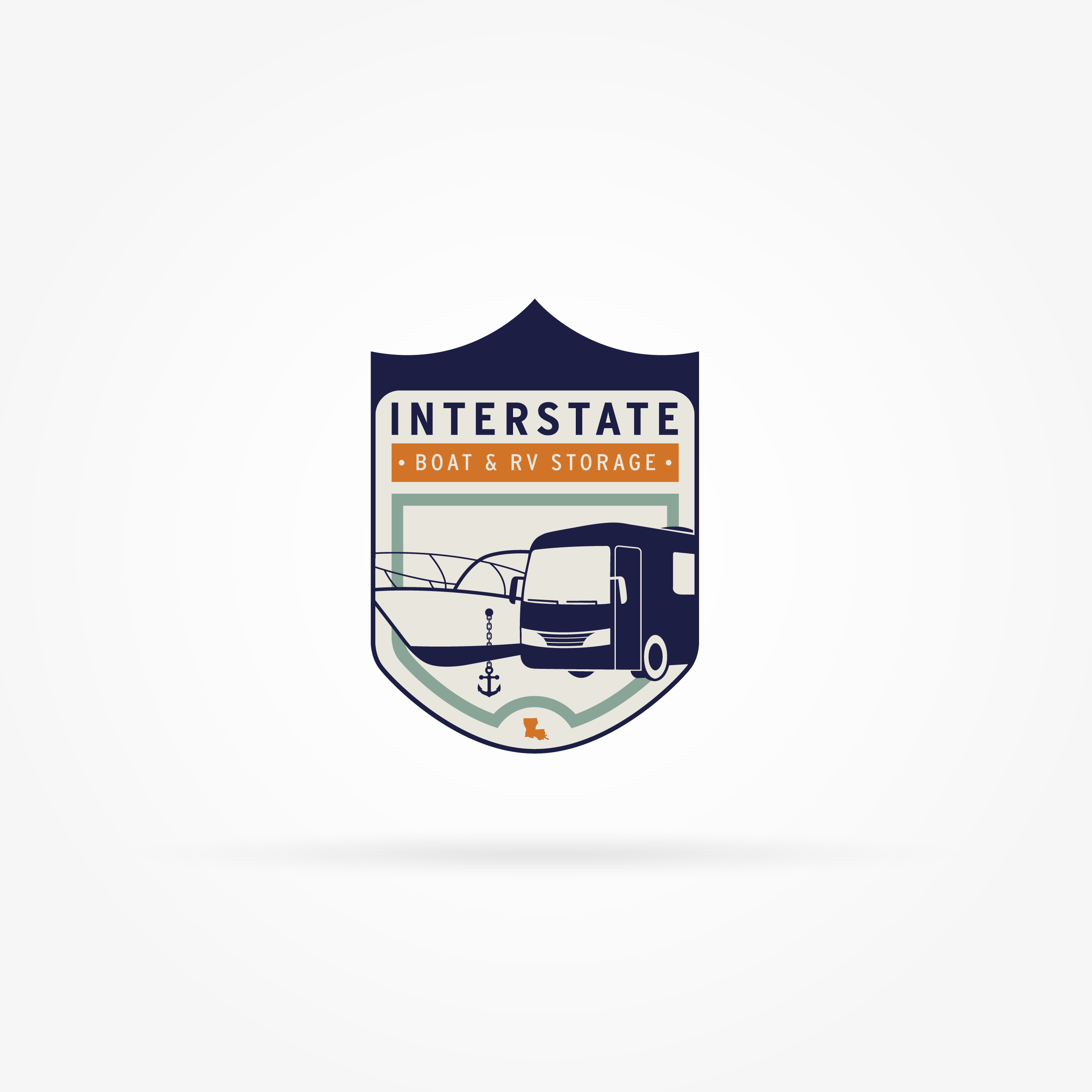


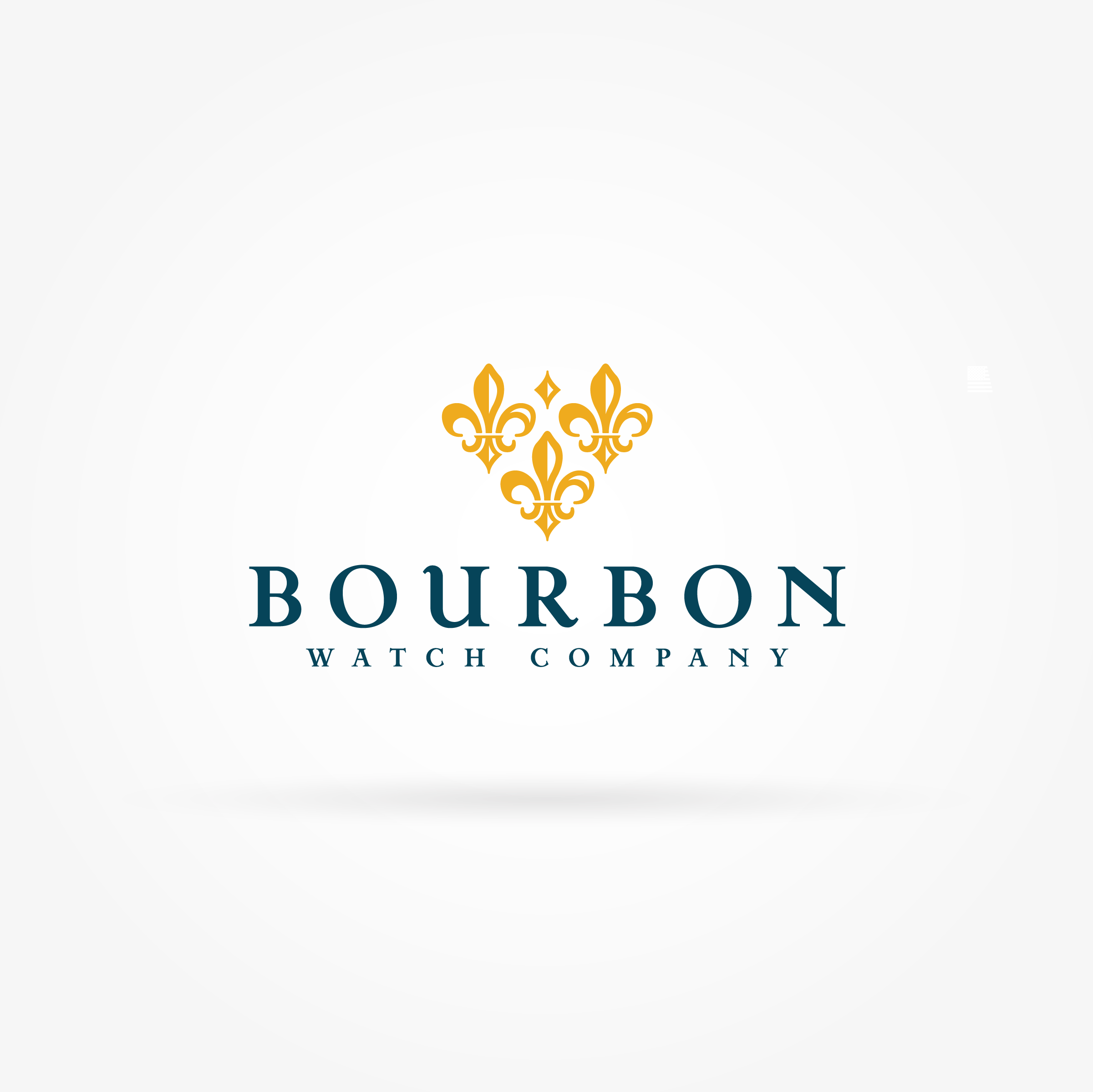
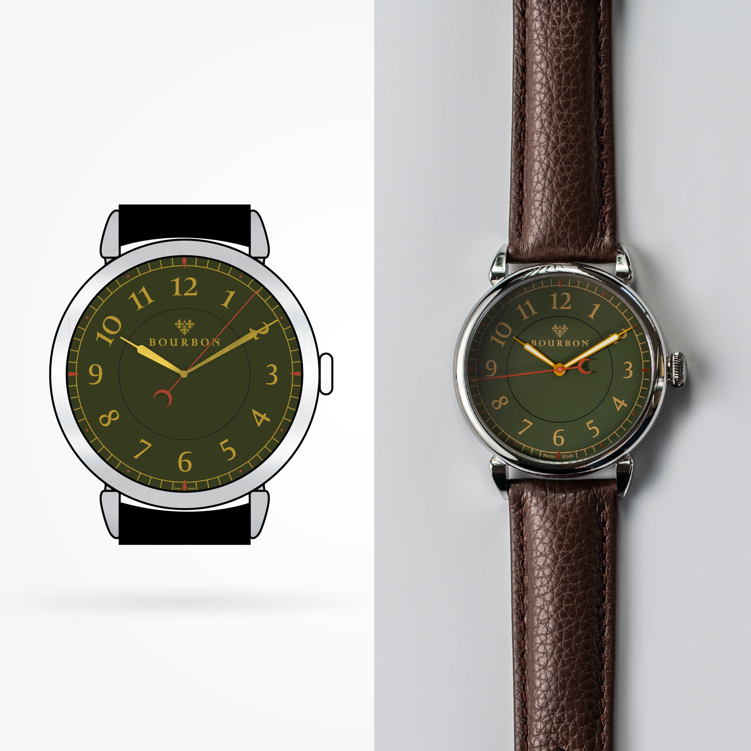
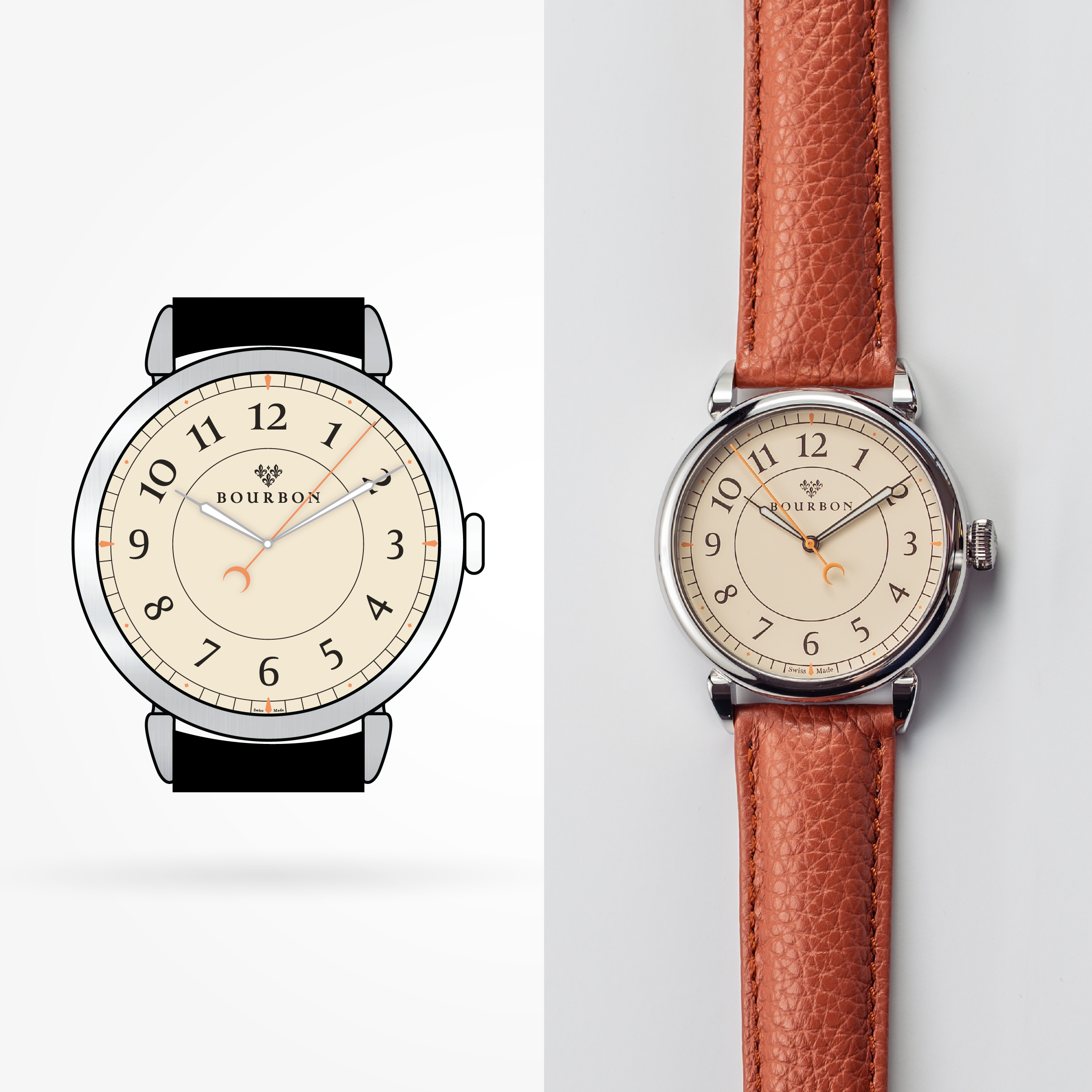
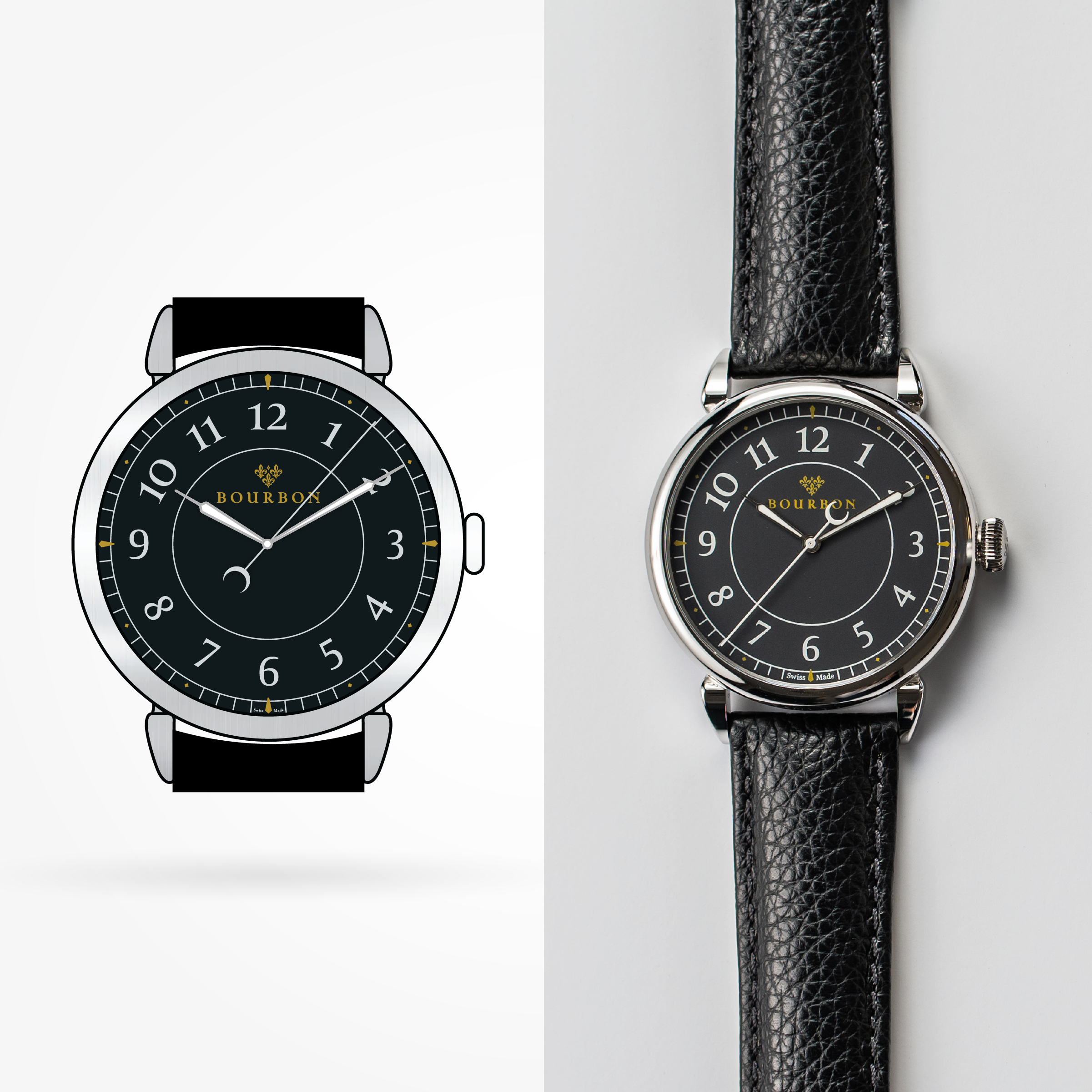
BRAND DESIGN
Creating meaningful brands inspiring loyal followings. Bringing your identity to life!
MORE THAN JUST A DESIGN. BORN TO STAND OUT!
In need of an identity? Become more than a logo within a sea of logos in your industry. I want to work with you to increase your exposure and improve your sales by your company becoming THE logo that customers remember, relate to and can easily describe to their neighbors.
You were born to stand out! You are here to make a difference. To have an impact whether it be on one person or it be the whole world. You have a personality, and therefore so does your brand. Time to reflect what it is people love about you and your business!
PRICING: [Please use form to schedule consultation to discuss your project!]
• ***$150 NON-REFUNDABLE CONSULTATION FEE***
- If project quote is approved, this fee will be deducted from final quoted price
- Includes 30min-1hr consultation, brand strategizing, and preliminary research for personalized branding quote
• Brand Design Packages Available:
- Simplicity/Complexity of the project will determine final price
- Stationary Design included
- Branding Color Document included
- Final Design Files included (EPS, PDF, JPG, PNG)
- Additional branding design needs to be discussed during consultation
Individual print project pricing available, See "Design."